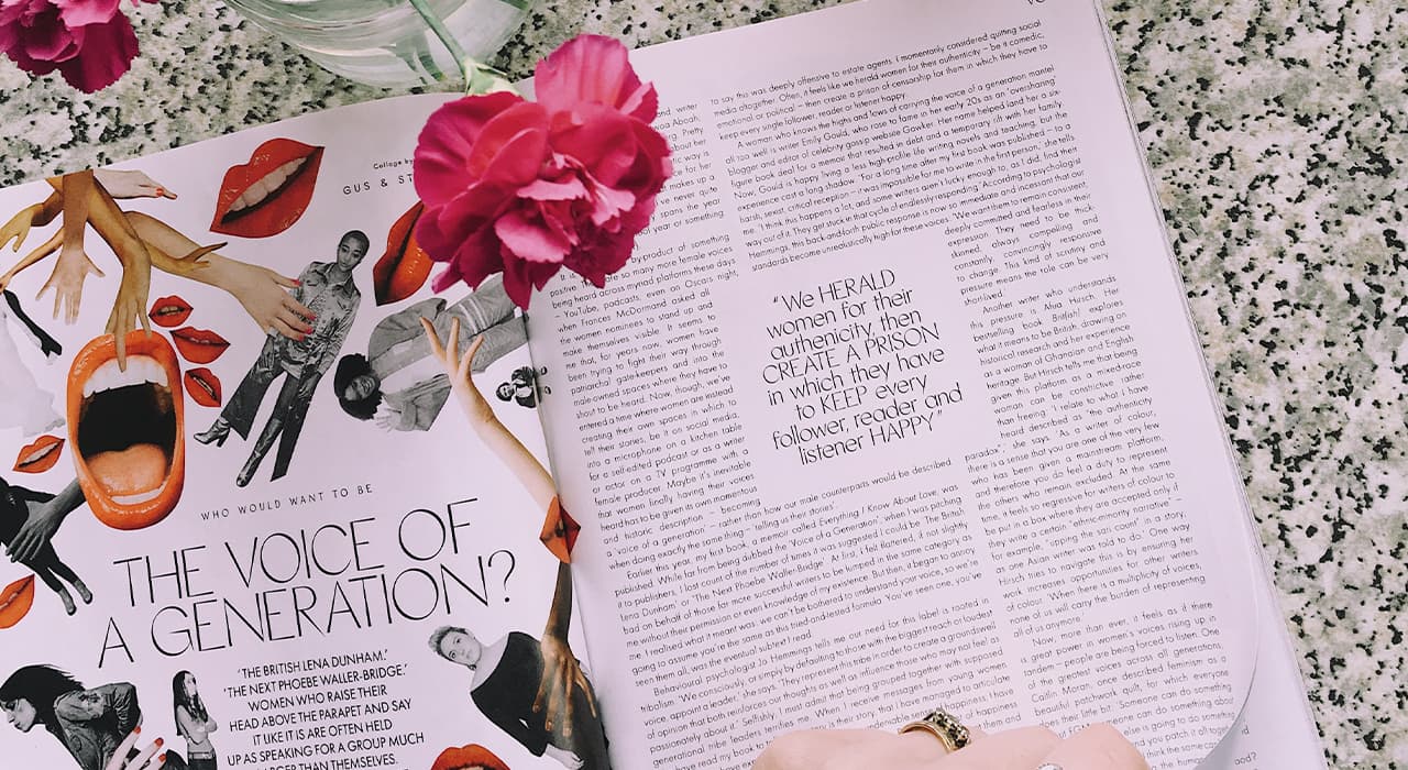
Illustration as a genre began its development precisely because of the mass production of books and newspapers. Magazines, newspapers, brochures, albums fight for attention through striking visual design.
Publishers are classified into book, newspaper, magazine, music, on-line, and others.
Periodicals choose and combine all the tools to express their ideas and sentiments. Typography and images are intertwined to capture and hold the viewer’s attention, stir emotions and intellect.
A variety of materials, color techniques and printing techniques allow you to create print products not only for the mass readership, but for premium niches as well.
Particular attention should be paid to children’s books, because children’s perception differs from that of adults – colors and plot can be very detailed, rich and act in close connection with the details in the text, to reveal the world of the story more fully. Pictures can make reading more emotional and also teach you to get a broader view of what’s going on.
Illustrations sometimes have a realistic look, but the most interesting ones are cartoonish. Mostly it depends on the plot of the book, the age of the reader, the wishes and capabilities of the authors. But it is desirable that the design was stylish and holistic, because, more often than not, it is with the first books begins the development of the reader’s taste.
For those who want to master this art, there’s The Adult Book of Children’s Illustration by Elina Ellis, which proves that it is achievable with any skill if you want to.
In the “Process” section of the children’s illustrated book site, artists show and tell how characters are born, angles are taken, techniques are chosen and communication with the authors takes place.
Music production, too, uses graphic language to better find its admirers. Album covers become identifying beacons for music lovers, and on tangible media become collector’s items.
